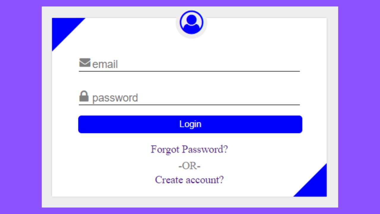
In this post, I’m going to design login page using only HTML and CSS. This login or sign-in form is fully responsive which will be adjust size in every device like PC, tablet, mobile.
Source Code is given below:
HTML
<!DOCTYPE html>
<html>
<head>
	<title>signin</title>
	<meta name="viewport" content="width=device-width, initial-scale=1.0">
	<link rel="stylesheet" href="https://cdnjs.cloudflare.com/ajax/libs/font-awesome/4.7.0/css/font-awesome.min.css">
	<link rel="stylesheet" type="text/css" href="style.css">
</head>
<body>
<div class="container">
	<form id="login-form" onsubmit="return validation()">
		<div>
			<span><i class="fa fa-user-circle-o"></i></span>
		</div>
		<div class="login-field">
			<i class="fa fa-envelope"></i>
			<input type="email" name="" placeholder="email" id="useremail">
			<span id="email_error"></span>
		</div>
		<div class="login-field">
			<i class="fa fa-lock fa-lg"></i>
			<input type="password" name="" placeholder="password">
		</div>
		<div>
			<button onclick="btnClick()">Login</button>
		</div>
		<div id="bottom-links">
			<div><a href="">Forgot Password?</a></div>
			<div>-OR-</div>
			<div><a href="">Create account?</a></div>
		</div>
	</form>
</div>
<script type="text/javascript">
	function validation(){
		var a=document.getElementById('useremail').value;
		if (a=="") {
			document.getElementById("email_error").innerHTML="";
			return false;
		}
	}
</script>
</body>
</html>
CSS
*{margin: 0;padding: 0;box-sizing: border-box;}
body{
	background-color: #eee;
}
.container{
	display: flex;
	justify-content: center;
}
#login-form{
	margin-top: 150px;
	background-color: #fff;
	box-shadow: 0 0 2px 0 #bbb;
	padding: 45px 25px 15px 25px;
	position: relative;
}
#login-form span{
	position: absolute;
	font-size: 35px;
	top:-16px;
	left: 45%;
	color:blue;
}
#login-form span i{
	background-color: #eee;
	border:6px solid #eee;
	border-radius: 50%;
}
.login-field input{
	width: 330px;
	font-size: 16px;
	margin: 15px;
	border: none;
	border-bottom: 1px solid #222;
	color:grey;
	padding-left: 20px;
}
.login-field input:focus{
	outline: none;
	border-bottom: 1px solid blue;
	color:#222;
}
#login-form button{
	background-color: blue;
	border:1px solid blue;
	color:#fff;
	width: 93%;
	padding: 5px 0 5px 0;
	border-radius: 5px;
	margin-left: 14px;
}
#login-form button:focus{
	outline: none;
}
#login-form button:hover{
	cursor: pointer;
	background-color: navy;
}
.login-field{
	position: relative;
}
.login-field i{
	position: absolute;
	left: 0;
	top: 14px;
	padding-left: 16px;
	color:grey;
}
#bottom-links{
	display: flex;
	flex-direction: column;
	align-items: center;
	padding-top: 15px;
}
#bottom-links a{
	text-decoration: none;
}
#bottom-links div:nth-of-type(1){
padding-bottom: 5px;
}
#bottom-links div:nth-of-type(2){
	padding-bottom: 2px;
	color:grey;
}
#login-form::after{
	content: "";
	position: absolute;
	width: 0;height: 0;left: 0;top: 0;
	border-top:50px solid blue;
	border-right:50px solid transparent;
}
#login-form::before{
	content: "";
	position: absolute;
	width: 0;height: 0;right: 0;bottom: 0;
	border-right:50px solid blue;
	border-top:50px solid transparent;
}

@media (max-width: 500px){
	.login-field input{
		width: 310px;
	}
}
@media (max-width: 400px){
	.login-field input{
		width: 250px;
	}
}
@media (max-width: 340px){
	.login-field input{
		width: 220px;
	}
}
@media (max-width: 310px){
	.login-field input{
		width: 200px;
	}
}
@media (max-width: 280px){
	.login-field input{
		width: 170px;
	}
}
Download Complete Project